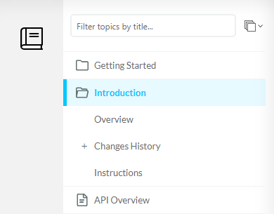
By default, in the Clear Sky template TOC nodes on the first level are different from all the deeper hierarchy levels: they either have the "folder" icon if they have child topics, or a page icon if they do not.
Level 2 and deeper nodes don't have a page icon. If a node of level 2 or deeper has child topics, it will have an expand icon "+", or, if expanded, collapse icon "-".
If you want to have a more classy look with the page icon for single topics and chevron "›" icon for expandable nodes, then you're in the right place.
How to implement
Since we're dealing with the Reader Interface, and not topic content, we will need to modify Branding.css.
Change expand/collapse icons
To change the “+” icon into “>” for collapsed nodes of level 2 and deeper, add the following to your Branding.css:
CSS |
.TocTreeLight_treeContainer .CHTree_desktopView .CHTree_nodeBtnExpand i::before { |
And to change the “-” into the “⌄”, add the following to the Branding.css:
CSS |
.TocTreeLight_treeContainer .CHTree_desktopView .CHTree_nodeBtnCollapse i::before { |
|
Tip |
| Since Font Awesome is used for these icons, you can select most of the icons from their library: Icons | Font Awesome. Just click any icon to open its page, and look for the four-character alphanumeric code. Copy it and replace the four-character alphanumeric in the CSS. Remember to leave the backslash "\" symbol before it. | |
Add page icon to TOC nodes
To add TOC "page" icon to TOC nodes, add something like this to your Branding.css:
CSS |
.CHTree_nodeL2 .CHTree_nodeContent.CHTree_nodeContentWithoutChildren.TocTree_tocNode.TocTreeLight_imgTopic::before { |
What we did is added a pseudo-element (::before) to each of the level 2 nodes (CHTree_nodeL2 class) with a transparent image as content (we need something there for this element to have an actual size on the page) and the actual icon as the background, plus added some padding to it to make it look good.
You can download the placeholder image and put it into your ClickHelp storage and link there instead.
To apply this to subsequent topic levels, you can add a similar selctor for other levels – just copy-paste it and instead of the “CHTree_nodeL2” class specify “CHTree_nodeL3”, and so on.
This is what you will get as the result: