In the Reader Interface section of Portal Settings, you configure the look of your portal's Reader UI, with a real-time preview of your changes.
| To learn how to preview your content as a reader, see How to Preview My Content. |
- Portal UI Template
- Portal UI Branding
- UI Colors
- Fixed Width Layout
- Application Header
- Application Footer
- Right/Left Sidebar
- Navigation Panel
- TOC Filter Visibility
- TOC Default State
- TOC Node Expand/Collapse Button Position
- TOC Node Click Behavior
- Index Keywords
- Topic Viewer
- Topic Viewer Header
| Different templates have different options available. Reader Interface settings do not affect the Contributor UI. |
Portal UI Template
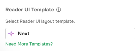
The Select portal UI layout template drop-down list sets the active Reader UI template. See Reader Interface Templates for the list of templates.
| Switching to another template discards all changes made to the current one. |
The Need More Templates? button opens a form to request a custom template. Depending on the scope, the request is handled through Technical Support or as a Branding service project.
Portal UI Branding
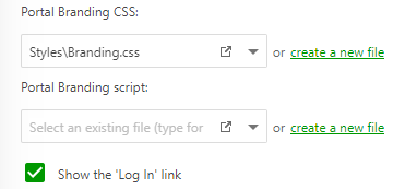
| Option | Description |
|---|---|
| Portal Branding CSS | Specifies a CSS file used to customize the Reader UI. |
| Portal Branding script | Specifies a JavaScript file that adds custom functionality to the Reader UI. |
| Show the 'Log In' link | Toggles the Log In button for unauthorized readers in the top-right corner. When off, readers can still authenticate through the direct login URL, and the User profile settings icon is hidden for Power Readers. |
By clicking the Open file in a new window button, you can open the correponding files for editing. The Create a new file link creates a new style or script file.
| To learn about style and script files, see Advanced Branding with CSS. |
UI Colors
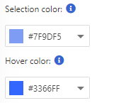
| Option | Description |
|---|---|
| Selection color | The highlight color for selected elements such as buttons, TOC nodes, and menu items. |
| Hover color | The highlight color for hovered elements - buttons, TOC nodes, menu items. |
Set each color from the palette, with the color picker, or by entering a HEX code.
Fixed Width Layout
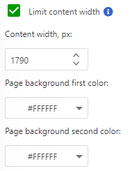
| Option | Description |
|---|---|
| Limit content width | When checked, limits the content area width to the Content width value. |
| Content width | The content area width, in pixels. |
| Page background first color | The first page background color. |
| Page background second color | The second page background color. |
| The area each background color affects depends on the template. The easiest way to learn which area of reader UI is the first and second background is to change these colors and check out how the preview has changed because the result will be different in different templates. |
Application Header
Application Header is the area at the top of every portal page except the Portal Home Page.
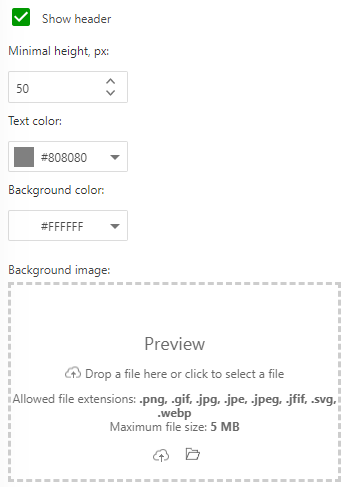
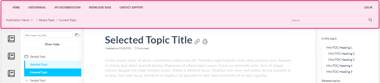
| Option | Description |
|---|---|
| Show header | Toggles the header on or off. |
| Minimal height | Sets the minimum header height. |
| Text color | Sets the header text color. |
| Background color | Sets the header background color. |
| Background image | Sets an image as the header background instead of a plain color. Click the preview area to browse, or drag and drop a file. |
Application Footer
Application Footer is the area at the bottom of every portal page except the Portal Home Page. It is off by default and has no content.
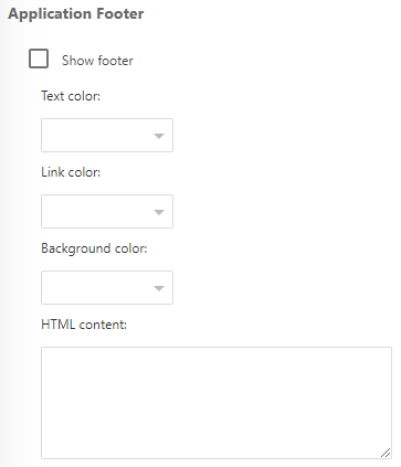
| Option | Description |
|---|---|
| Show footer | Toggles the footer on or off. |
| HTML content | The content shown in the footer. Accepts plain text or full HTML with styles and scripts. |
| Text color | Sets the footer text color. |
| Link color | Sets the footer link color. |
| Background color | Sets the footer background color. |
Right/Left Sidebar
The Right Sidebar (a Left Sidebar in some templates) appears at the side of the Reader UI. It commonly contains the Mini-TOC and See Also List.

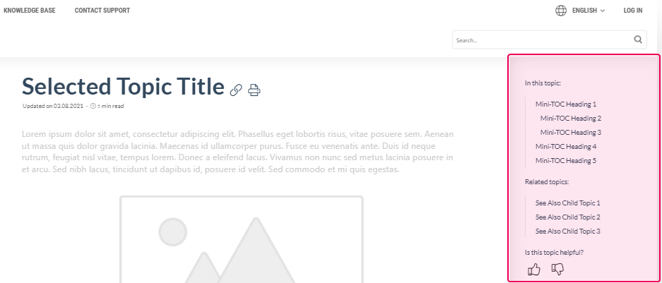
| Option | Description |
|---|---|
| Show sidebar | Toggles the sidebar on or off. |
| Width | Sets the sidebar width. |
| Text color | Sets the sidebar text color. |
| Link color | Sets the sidebar link color. |
| Background color | Sets the sidebar background color. |
Navigation Panel
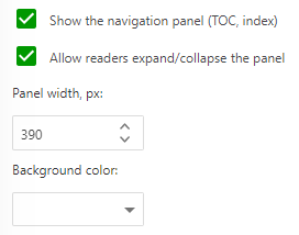
| Option | Description |
|---|---|
| Show the navigation panel | Toggles the Navigation Panel, which contains the Table of Contents (TOC), the Show Index button, and the Topics filter field. |
| Allow readers expand/collapse the panel | When checked, readers can expand and collapse the panel. |
| Panel width | Sets the panel width. |
| Background color | Sets the panel background color. |
TOC Filter Visibility
The Show the TOC quick filter box above TOC checkbox toggles the Topics filter field above the TOC.
TOC Default State
Sets the default state of TOC nodes:
- All nodes collapsed.
- Levels expanded — sets the maximum node level expanded by default. Levels 1–3 are available.
- All nodes expanded.
TOC Node Expand/Collapse Button Position
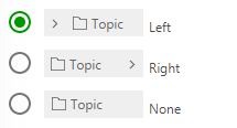
Sets the position of the TOC Node Expand/Collapse button: left of the caption, right of the caption, or disabled. If disabled, consider enabling Expand/collapse nodes on caption click below.
TOC Node Click Behavior
The Expand/collapse nodes on caption click checkbox: when checked, clicking an unfocused node's caption also expands or collapses it, in addition to focusing it. Clicking an already-focused node's caption always toggles its state, regardless of this option.
| This option affects desktop browsers only. |
Index Keywords
The Show Index Keywords checkbox toggles the Show Index button. See Index Keywords.
Topic Viewer
Manages additional Topic Viewer options. The # column matches the numbered callouts in the screenshot.
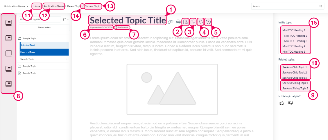
| # | Option | Description |
|---|---|---|
| 1 | Show topic title | Toggles the topic title. |
| 2 | Show the 'Download topic as PDF' button | Toggles the 'Download Topic as PDF' button. |
| 3 | Show the 'Copy topic as Markdown' button | Toggles the 'Copy Topic as Markdown' button. |
| 4 | Allow Power Readers to subscribe to topics | Toggles the 'Subscribe to topic updates' button. |
| 5 | Allow readers to see topic changes | Toggles the 'Topic changes' button. |
| 6 | Show the 'Updated on' information | Toggles the 'Updated on' label. |
| 7 | Show time to read | Toggles the 'Time to read' label. |
| 8 | Show publications bar | Toggles the publications bar. Available only in the Clear Sky template. |
| 9 | Include sibling topics in Related Topics | When checked, includes same-level topics in the Related Topics panel. |
| 10 | Include child topics in Related Topics | When checked, includes child topics in the Related Topics panel. |
| 11 | Show the Home link in breadcrumb | Toggles the 'Home' link in the breadcrumb. |
| 12 | Show current publication link in breadcrumb | Toggles the current publication link in the breadcrumb. |
| 13 | Show current topic title in breadcrumb | Toggles the current topic title in the breadcrumb. |
| 14 | Breadcrumb items separator | Sets the breadcrumb separator. Accepts any characters or HTML markup. |
| 15 | Mini-TOC max heading level | Sets the maximum heading level shown in the Mini-TOC. |
Topic Viewer Header
Topic Viewer Header is the area above a topic's content.
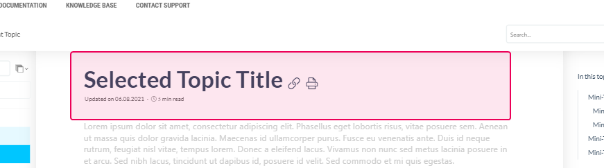
| Option | Description |
|---|---|
| Show topic header in the Topic Viewer | Toggles the Topic Viewer Header area. |
| Text color | Sets the header text color. |
| Background color | Sets the header background color. |